The Power of Simplicity: Minimalist Design Principles for SaaS UX

“Less is more” is a catchy phrase we’ve all heard before, and it’s regularly associated with minimalist design. In recent years, minimalistic design trends have dominated the charts, and it’s the primary choice for web design. You probably have noticed how websites and apps lean towards simplistic designs, and we tend to be interested in the concept.
Minimalism is more than just a design aesthetic; it embraces simplicity and functionality. In the world of SaaS website design, minimalism strips away any unnecessary elements, leaving only the things that matter most. This creates a clean, uncluttered space where visitors feel calm and tranquil. Minimalist design focuses on simple color palettes, the use of negative space, and clean lines, creating a website that’s easy to navigate and visually pleasing.
Minimalism design in website UX
A minimalist website design is a simplified interface that displays the essential components that focus on the main content. As mentioned earlier, it embraces the “less is more” concept. The entire point is to eliminate unnecessary elements that don’t offer much value to the user journey.
Minimalism is the perfect balance of aesthetics and visual communication. The color palette may vary depending on your brand niche and the communication you deliver to your audience. In other words, the message is delivered more directly instead of adding extra features and gimmicks.
Embracing the minimalism UX design trend
The transition from bulky design layouts and heavy content to minimalist design has been a game-changer for web designers. It’s like a breath of fresh air, allowing designers to create more intuitive and engaging websites that put the user at the center. This shift in design trends has opened up a world of possibilities, and minimalist design is leading the way.
Even though the websites may initially look too simple, you can find out how the user experience flows better when navigating through them. Minimalism prioritizes usability over visuals; stunning minimal design does not mean less creativity.
Best practices for a minimalist website design

Minimalist product and web design focuses more on the experience and how it influences users’ emotions and behavior. Let’s take a look at the key elements of this design feature and the benefits it brings to your SaaS website.
1. Negative space
A minimal design fully uses white or negative space, which is the space surrounding the key elements that help create visual harmony. White space also refers to the space around objects or media, allowing some ‘breathing” time between key elements. It’s an essential element that is the backbone of a minimalistic web design.
But why is space important? You’ll have plenty of negative space when you eliminate the unnecessary elements. This prevents all kinds of distractions and helps bring visual hierarchy to the design. It plays a big role in more seamless navigation and highlights your CTAs.
2. Typography
Typography is about how text looks and is presented in an interface. It consists of:
- Font choices – we recommend sans serifs like Arial, you can look for inspiration on Google Fonts and Adobe Fonts, they offer great options
- Text size
- Text styling -italic, bold, etc
- Letter spacing
- Line heights between paragraphs
Minimalistic typography maximizes clarity and readability by avoiding fancy or elaborate display fonts. The goal is to keep your copy focused and clean, so it won’t distract your audience from other elements. Simple, standard fonts like Verdana or Helvetica are excellent choices for this.
3. Color
Color massively impacts interfaces. It can draw attention, reflect your brand image, and even drive users to take action. Colors tend to trigger users’ emotions, so remember the ones that represent your brand first.
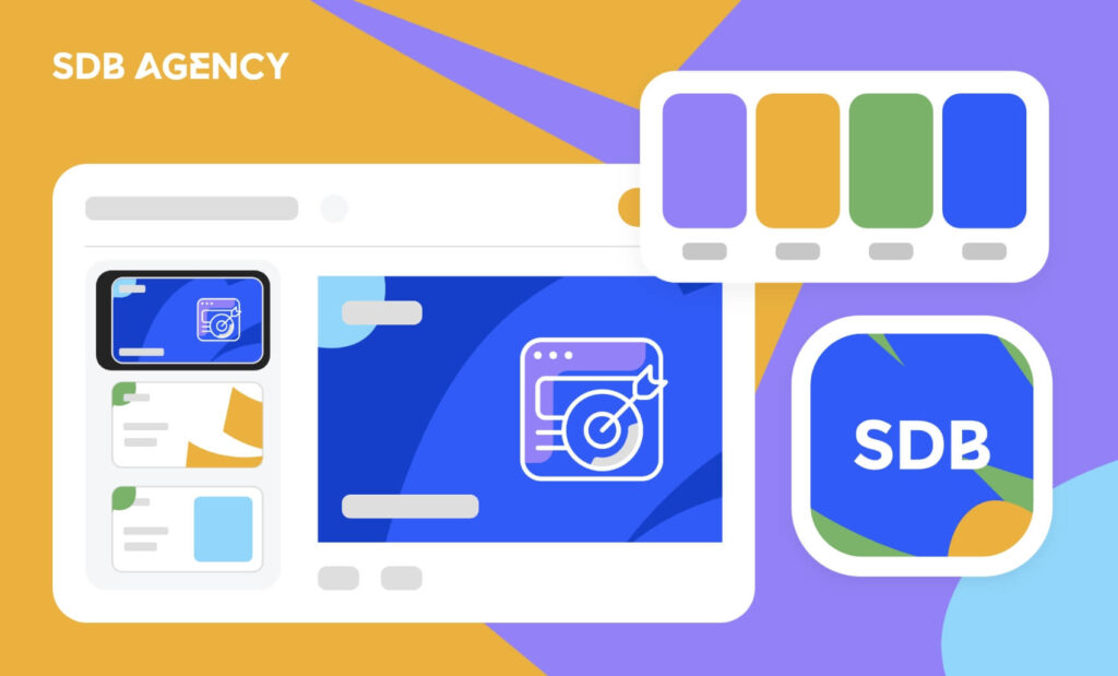
A minimalist design requires careful and strategic use of color. Overusing bright, saturated hues may create a chaotic mood. Instead, apply color sparingly; your website should have no more than two to three colors.
4. Website layout
The minimal website layout requires proper placement of elements and content, resulting in effective site navigation. Grid layouts work great for a minimal look, creating balance in the design and helping design mobile responsive websites.
Make sure that the headings and your most important information are placed at the top of the page to grab the readers’ attention. The bottom line of a minimal website structure is to offer a cohesive website that understands how users navigate a site.
5. Visual chunking
Use descriptive headers and subheads to break up longer text into shorter, more scannable sections. This practice ensures that the content hierarchy consistently matches other UI components. Beautiful typography styles can complement any visual chunking without affecting the minimalism concept.
4 common mistakes to avoid when designing a minimalist website

Embracing minimalism offers tremendous benefits to your site. However, poor execution has its risks. It’s easy to get carried away with the concept and strip away too much functionality or context during the process. Here are some major pitfalls to avoid.
1. Losing important UI elements
It’s tempting to fully execute visual simplicity by trimming secondary site functions. However, these decisions usually offer necessary usability hints, such as the hamburger menu when browsing through mobile.
Hidden elements may cause friction as users must learn and remember undisclosed options. Therefore, ask yourself if eliminating these elements will be worth it, even if they seem minor.
2. Imbalanced visual hierarchy
Interfaces must provide proper guidance with the help of contrast to guide visitors effectively. However, when taken too far, minimalism can flatten everything to the ground.
If nothing pops up through styling and layout, visitors will be confused about where to focus. Plain uniformity drives off conversion opportunities that should have been emphasized. Therefore, remember to put key areas in the spotlight.
3. Too much white space
Even though we advise it, too much white or negative space can make interfaces feel empty. Pages with plenty of unused areas surrounding a narrow-centered column are a poor way of providing information.
Layouts must have the right amount of spatial calibration depending on the page and user priorities. For the best outcomes, balance generous breathing room with enough content.
4. Don’t go overboard with minimalism
Minimalist websites are currently very popular, but that doesn’t mean you can strip away all elements from your site and call it minimalist. It’s crucial not to go too far. When talking to your designer, be sure to specify which elements are essential for your website and which are less critical. The typical approach involves using a lot of white space and limiting the use of other colors. Properly organizing these elements is key to providing an excellent experience for your visitors.
Conclusion
When done properly, minimalism is one of the driving forces for building contemporary digital experiences for SaaS websites. It offers users the necessary breathing room while still maintaining critical functionality. Devices continue to evolve rapidly, so users also need adaptable interfaces as humans look for effortless user experiences. This requires simplification and editing while maintaining the needed complexity.
By mastering the minimalist techniques listed above, you can create stellar interfaces that continue to engage users in the long run.


