Essential Brand Collateral for SaaS: Building a Cohesive Identity
A successful SaaS brand always leaves a lasting impression on its customers.
How your customers remember your brand requires much more than a pretty logo or the products you offer. Indeed, these elements are still important, but they are only several pieces of the overall puzzle required to build a brand that will stand out from your competitors.
Creating a brand that appeals to every sense of your customers is essential for a chosen identity and recognition in your industry. In the long run, this will lead to strong and lasting brand loyalty from your customers.
6 essential brand elements for SaaS
Each of these six elements is crucial in shaping a brand that shows your customers who you are and why they should choose you over your competitors.
Without them, there’s nothing your customers will remember you by. If your consumers can’t remember you, they likely won’t purchase your products, which will cause a short lifespan for your business.
Before presenting your products to the market, nail these elements first. Once you’ve established your brand with careful planning, it will stand out and blow all your competitors away. Just remember to make it creative and memorable.
Let’s begin.
1. Name
One of the most important elements is your brand name. It defines everything in a few words and offers consumers a perception of who you are. Remember that your brand name is likely people’s first impression of you.
Coming up with a good brand name isn’t easy. There are many variables to consider, such as the image you want to portray, market availability, and how it aligns with your brand strategy.
However, once you have all the right elements, your brand can become the next household name, like Coke or Band-Aid. Who even says, “Can you pass me a glass of the black soda?” No one.
This is an example of how a brand name for the product became more popular than the actual product. That’s how iconic the “Coke” name is.
2. Logo
A logo is a brand’s visual trademark that is arguably just as important, if not more important, than a brand’s name. The reason is that images are usually remembered more easily than words.
There are many types of logos, one of the most common being the wordmark. A wordmark is a visual representation of the brand’s name, skillfully designed using the brand’s fonts and colors. It serves as the logo in place of a traditional image.
Think of brands like Google and eBay, which are excellent examples of wordmarks.
It is also crucial to design different logo lockups that represent your brand standard. This means creating various logo sizes and colors when the primary logo may not fit well on different promotional collateral types.
Think about Apple. They have a simple brand name with a minimalistic logo that fits with it. Both elements represent the brand’s sleekness and simplicity, which is why Apple is one of the most recognizable brands today.
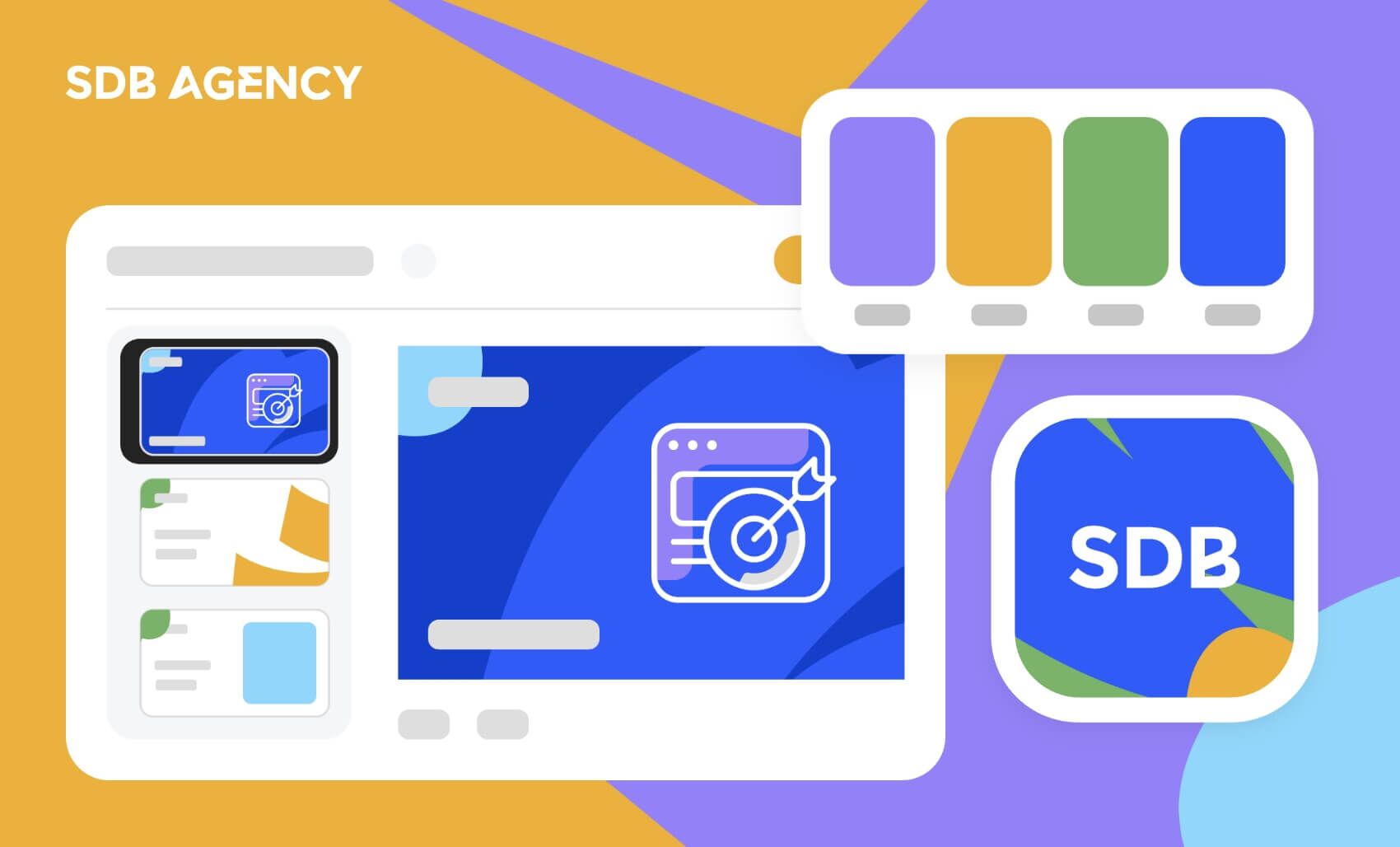
3. Brand colors
Colors are powerful. Specific colors can make us feel a certain way, and it’s a universal trait. A color can mean a certain thing, and that’s just the way it works.
For instance, when we think of the color red, we are often reminded of danger, stopping, errors, urgency, and more. Why is this? There is much more to color psychology in business, so let’s examine how color influences your brand.
Choosing the right color for your brand means understanding its message and the kind of audience you aim to appeal to. Once you understand that, choosing the right color should be a breeze.
4. Slogan
This catchy phrase defines a brand’s position in just a line of words. It must be memorable, easy to remember, and suit your brand’s personality.
You won’t want to create humorous catchphrases if you’re a business that handles money, as your customers expect you to be professional when handling their assets. Slogans like McDonald’s “I’m Lovin’ it.” portray the feeling they want to have when buying their food and beverage.
Your chosen slogan should remain relevant to your brand’s mission throughout the years. Therefore, you shouldn’t change your slogan too often, as this may confuse your customers. However, refreshing your image and ensuring that your slogan matches what you stand for are also important.
5. Graphics
Graphics are an element in a brand that isn’t the same as logos but is used to supplement them. And if done correctly, your customers may recognize them as much as your logo.
Graphics usually showcase your brand’s entire assets. You can do this by using a full-color palette or modeling the designs after a specific element or logo. These graphics are applied to every advertising and marketing collateral piece to improve its appearance without making it look redundant or relying solely on the logo.
6. Typography
The typeface and brand font your SaaS company uses can be based on the style of your logo or something entirely different without looking out of place. Ensure that your chosen typography blends effortlessly with your brand’s elements. Just like color, fonts can evoke specific emotions that must match your brand’s personality.
After choosing a font, ensure it is consistently used across all your brand’s materials and collateral. This includes everything from small details, such as the font used in company emails, to large-scale designs, like highway billboards.
Start branding with SDB Agency!
When considering the success of the companies highlighted in this article, it’s easy to see how vital these six elements are to shaping a brand’s identity.
While their products are undoubtedly impressive, the branded elements they’ve crafted over the years have propelled their success and cemented their iconic status.
Each element contributes to the bigger picture of brand identity, and executing them effectively is essential for building a strong presence and fostering a positive customer perception. Dare to think creatively, embrace originality, and uncover what sets your brand apart.
Need expert branding solutions for your SaaS business? Get in touch today, and let’s start building your success story!
Need help improving your SaaS site or product? Get in touch! We can help.

Curious, rebellious learner. Passionate about design, philosophy, and psychology. Loves ice cream, family, and simplicity. Always growing through new experiences.


